> ## Documentation Index
> Fetch the complete documentation index at: https://lightdash-06-24-docs-simplify-date-zoom-usage-description.mintlify.site/llms.txt
> Use this file to discover all available pages before exploring further.
# Bar chart
> Use bar charts to compare things between different groups or track how a number changes over time.
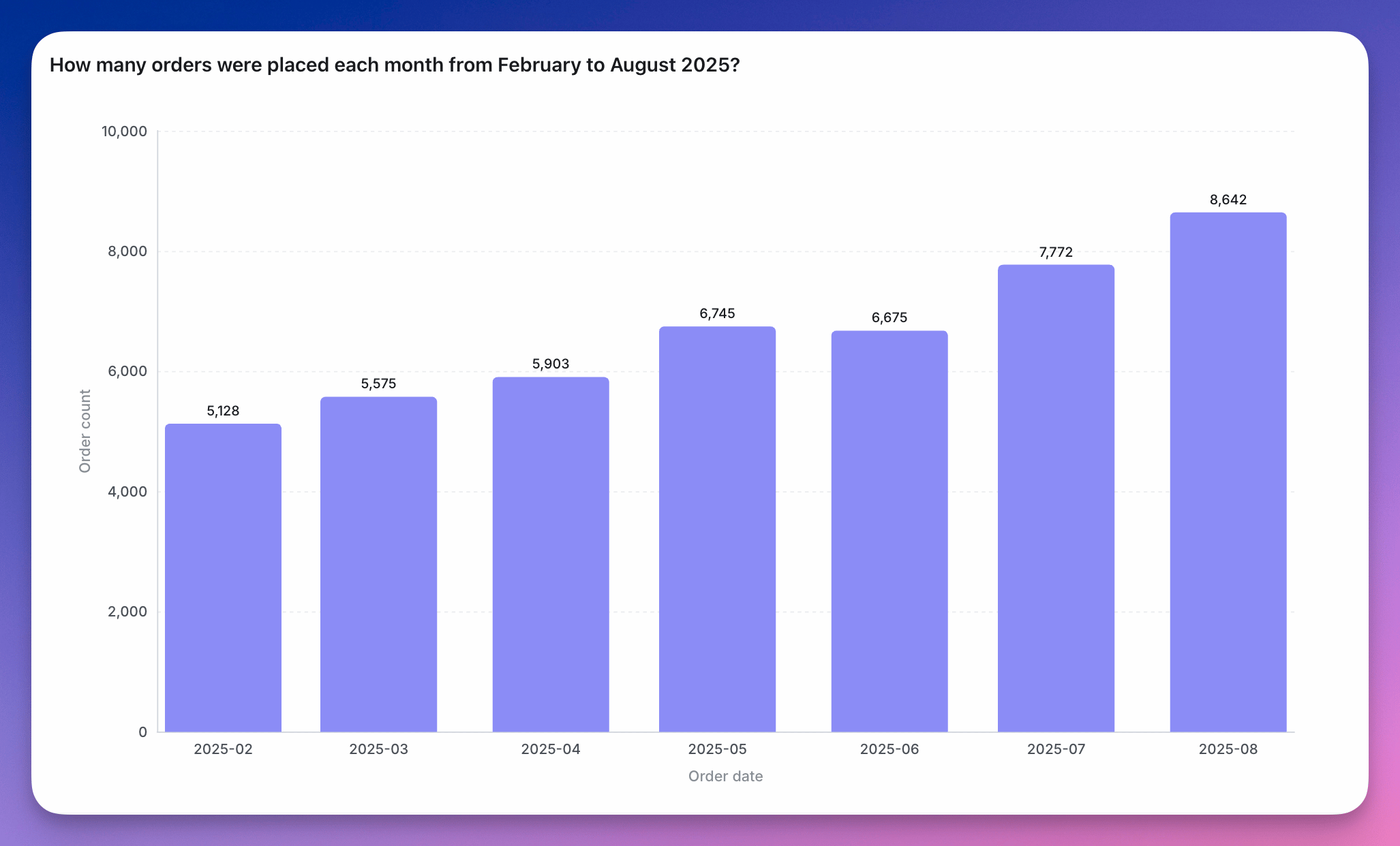 Bar charts are helpful to:
* compare things between different groups (e.g. the number of orders you have by product type)
* track how a number changes over time if you have a *smaller number of x-axis values* (e.g. number of new users per month over a year).
Check out more details about bar chart configurations [here](/guides/configure-charts).
## Stacked bar chart
Bar charts are helpful to:
* compare things between different groups (e.g. the number of orders you have by product type)
* track how a number changes over time if you have a *smaller number of x-axis values* (e.g. number of new users per month over a year).
Check out more details about bar chart configurations [here](/guides/configure-charts).
## Stacked bar chart
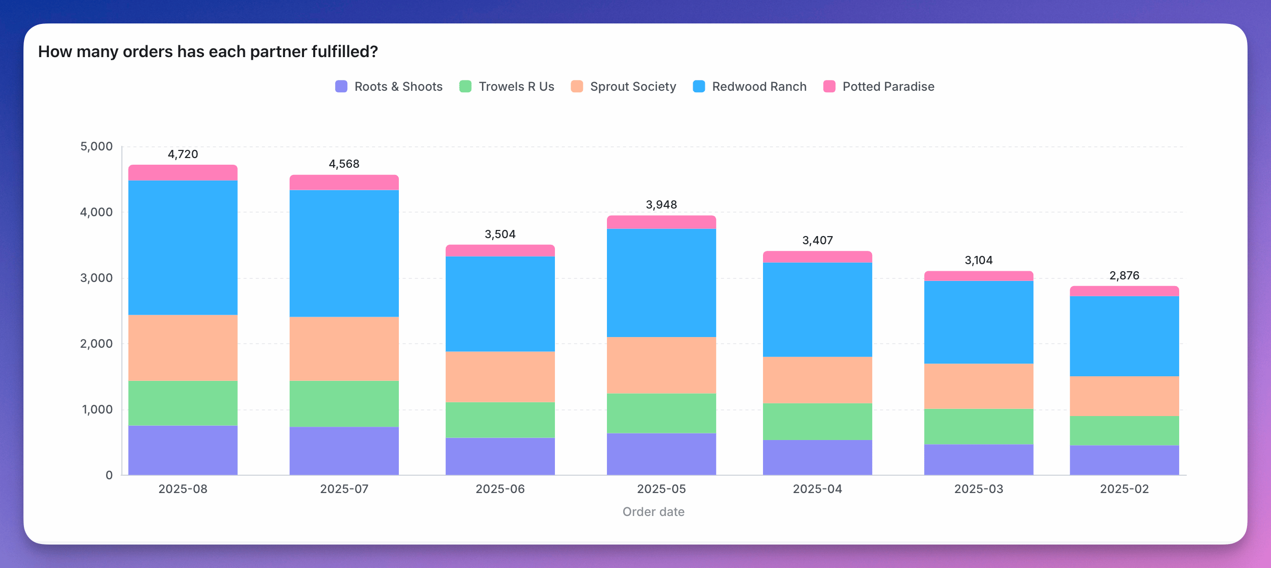 You can also stack bar charts to compare proportions across different groups.
Stacked bar charts work best when:
* ***the focus of the chart is to compare the totals and one part of the totals.*** It's hard to compare bars if they don't start at the same baseline. So, if you're trying to build a chart to compare multiple parts of your total with each other, consider keeping your bar chart unstacked!
* ***you're trying to show the parts of multiple totals***. If you only want to show parts of one total, consider an unstacked bar chart instead. If you only want to communicate one part of one total, consider if you should be using a big value chart instead.
## 100% Stacked bar chart
You can also stack bar charts to compare proportions across different groups.
Stacked bar charts work best when:
* ***the focus of the chart is to compare the totals and one part of the totals.*** It's hard to compare bars if they don't start at the same baseline. So, if you're trying to build a chart to compare multiple parts of your total with each other, consider keeping your bar chart unstacked!
* ***you're trying to show the parts of multiple totals***. If you only want to show parts of one total, consider an unstacked bar chart instead. If you only want to communicate one part of one total, consider if you should be using a big value chart instead.
## 100% Stacked bar chart
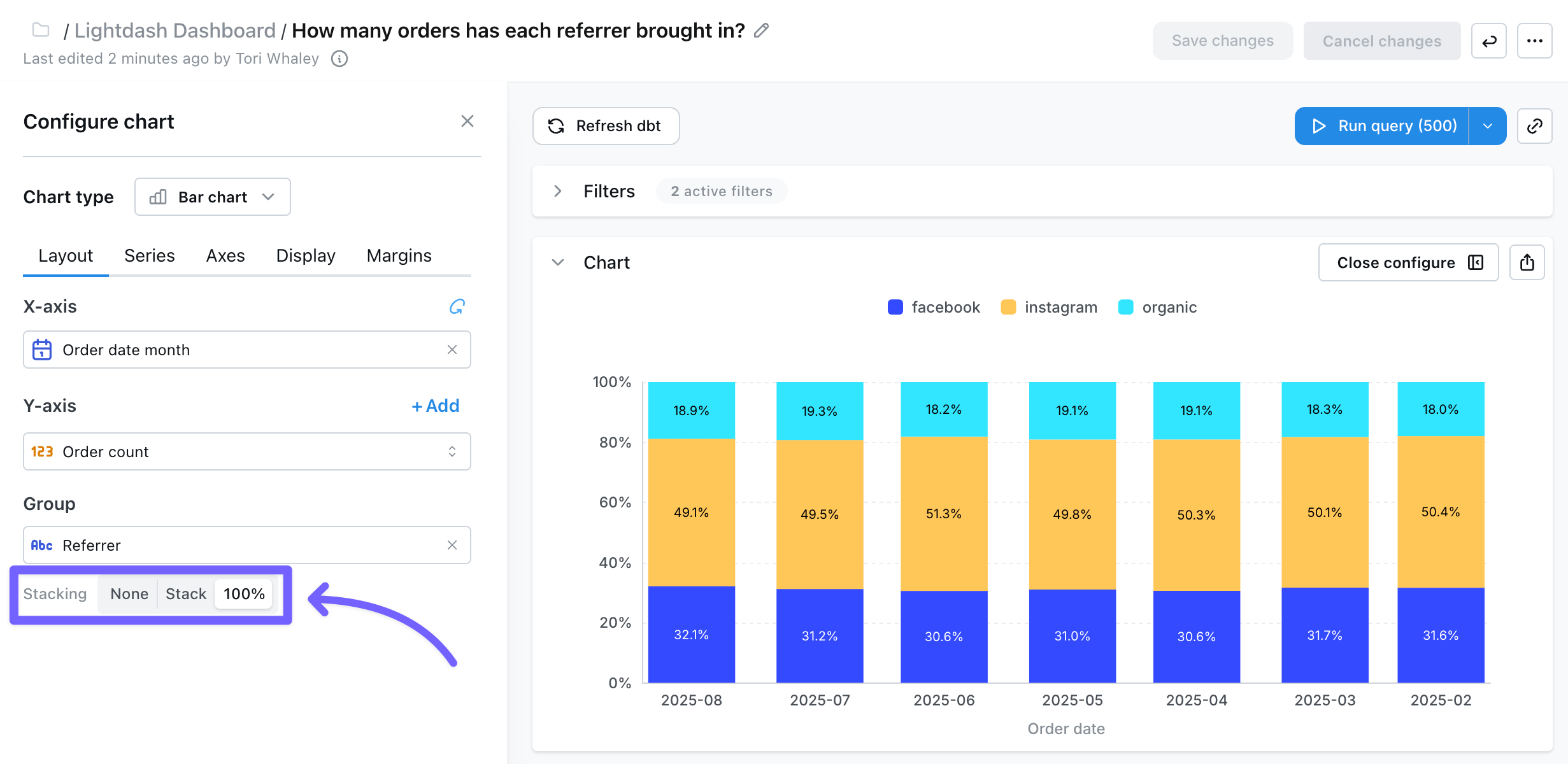
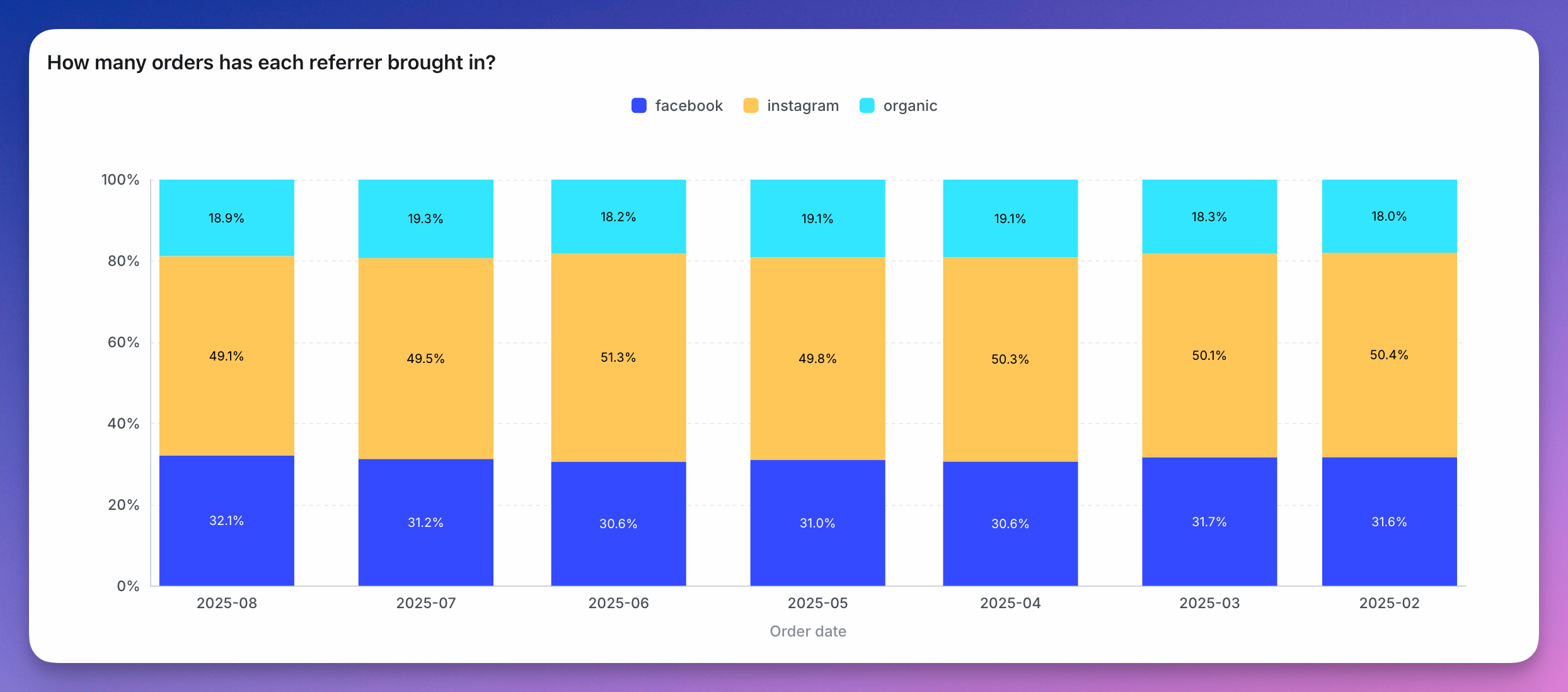 You can easily create 100% stacked bar charts easily by just selecting the `100%` stacking option on the chart configuration. After enabling this option, we will automatically transform the data and the axes to display a 100% stacked bar chart.
 You can also create a 100% stacked bar chart by setting up a [table calculation for percent of group total](/guides/table-calculations/table-calculation-sql-templates/percent-of-group-pivot-total). Use your x-axis dimension as the `column_i_want_to_group_by`, then in your chart configuration choose your x-axis, group dimension, and the new table calculation as your y-axis.
100% Stacked Bar Charts are useful when you need to visualize how the composition of a metric changes over time, or how the composition changes across different groups.
You can also create a 100% stacked bar chart by setting up a [table calculation for percent of group total](/guides/table-calculations/table-calculation-sql-templates/percent-of-group-pivot-total). Use your x-axis dimension as the `column_i_want_to_group_by`, then in your chart configuration choose your x-axis, group dimension, and the new table calculation as your y-axis.
100% Stacked Bar Charts are useful when you need to visualize how the composition of a metric changes over time, or how the composition changes across different groups.